
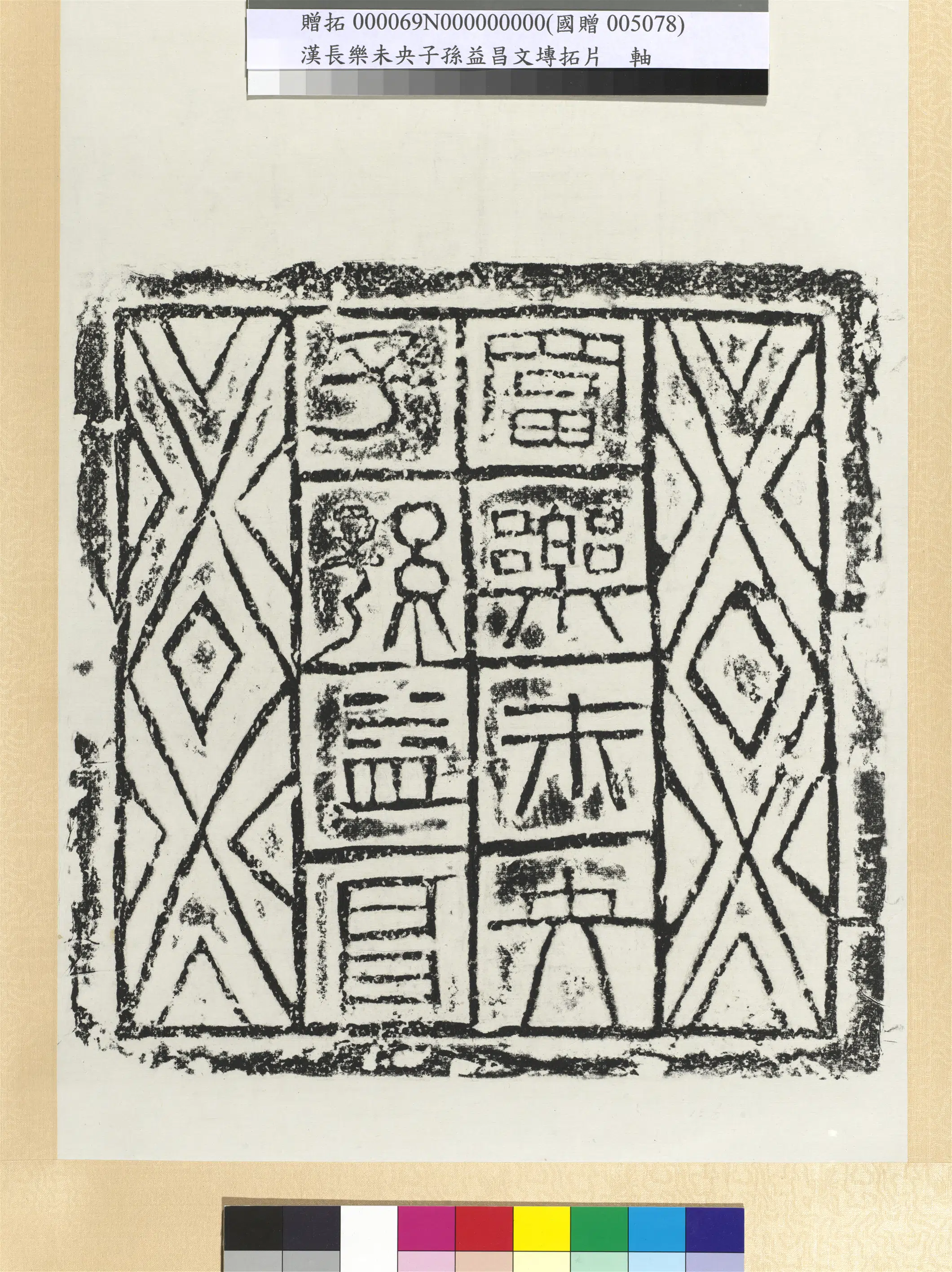
【国画基本信息】
| 品名 | 汉富乐未央子孙益昌砖墨拓图轴-2 |
| 朝代 | 汉代 |
| 文件大小 | 18.01MB |
| 分辨率 | 300x300 |
| 像素大小 | 2120x2832 |
| 尺寸(CM) | 17.94x23.97 |
| 作品数量 | 1 |
| 作品收藏 | 台北故宫博物院 |
| 图片格式 | 默认提供TIF和JPG两个版本 |
基本数据
| 藏品类型 | 墨拓,书法 |
| 品名 | 汉富乐未央子孙益昌砖墨拓 轴 Brick Rubbing of "Rich Joy Forever, Descendants Flourishing" |
| 分类 | 拓片 |
| 书体 | 隶书 |
| 数量 | 一轴 |
| 作品语文 | 汉文 |
| 释文 | 富乐未央。子孙益昌。 |
典藏尺寸
| 【位置】 | 【尺寸】(公分) |
| 本幅 | 60.8x33 |
| 全幅 | 143x39.4 |
质地
| 【质地位置】 | 【质地】 |
| 本幅 | 纸 |
参考数据
| 【类别】 | 【参考数据】 |
| 网页展示说明 | 汉代砖文的面貌素以多样化为人称奇,从古文、缪篆到当时通行的隶书,各种书体同时并行,有时兼融两种书体,亦予人耳目一新的感觉。由于砖文书法多成于寻常百姓,在随兴删难省繁之际,间或凭添若干趣味。砖面纹样与文字之间的安排,往往具见巧思慧心,如此方富乐砖,左右装饰菱形二方连续纹样,线条简明,将隶体兼篆的吉祥文字安置中间,别具美感。本幅为叶公超先生捐赠。(20110407) |
| 网页展示说明 | Han brick writing is famous for its great variety, with everything from ancient script and curving mou-seal script to the clerical prevalent then. Different script types were all used, sometimes even with two mixed together, giving a fresh and new look. Since brick calligraphy mostly involved the masses, some freedom in abbreviating or simplifying sometimes added a bit of interest as well. The arrangement of decoration and text on bricks was also often clever, such as this brick of joy and prosperity, in which a continuous diamond-shape pattern on the left and right decorates the surface. The lines are simple and clear, the clerical forms with seal-script auspicious text placed in the middle for an aesthetic effect. Mr. Yeh Kung-shao donated this piece to the National Palace Museum. (20110407) |
| 网页展示说明 | 汉代の砖文の多様性には感叹させられる。古文や缪篆から当时普及していた隶书までが同时期に用いられ、时には2种类の书体を融合させており、新鲜な印象を受ける。砖文の多くが一般庶民の手によるものであるため、书き手が好きなように省略したり修正を加える中で、面白味が增している。砖面の文様と文字の配置には工夫を凝らしたものが多い。例えば本作は、方形の左右両侧に菱形を连ねた装饰模様が简洁な线で表现されており、隶书と篆书を融合させたような吉祥文字が中ほどに置かれ、独特の美感がある。叶公超氏寄赠。(20110407) |
